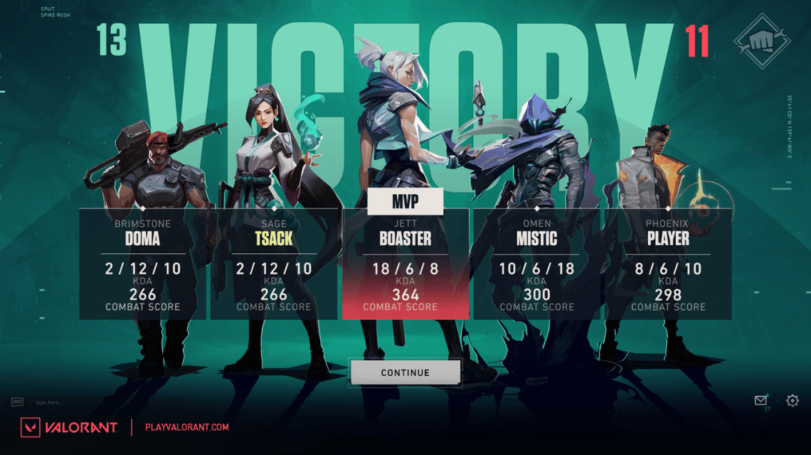
Screen After Match. Source: EsportsDriven
Riot Games is back to innovating and making changes to make Valorant a better game. Not only Battle Pass, Riot Games also provides changes to the Valorant UI update.
This time, VCGamers will provide examples and explanations regarding the UI update which will be released soon after the Episode 5 Act 3 update. For those of you who are curious, let's see the discussion below!
Also Read: Harbor Valorant Gameplay and Skills, So OP!
The first Valorant UI update is the Main Menu view. When you first enter the Valorant game, you will be greeted with a video from the Harbor trailer as the background.
Next, choose Play, Career, Battle Pass, Collection, Agents, and Store is no longer above the main menu. Instead, Riot Games moved the menu to the left.
Also Read: Strengths and Weaknesses of Neon Valorant, The Sickest Duelist!
When you want to play, you will choose the Play menu. After selecting the Play menu, there is a different lobby menu.
According to the author, the appearance of the new lobby is nicer and more comfortable to look at than the previous lobby. This time, the accent color in the lobby is darker thanks to the dark blue color that is in the background.
Not only that, the menu on the right is also more compact and comfortable to look at.
After you find a match, there will be a pop up telling you that you found a match. In the past, Match Found's appearance was very bland and didn't have a unique aesthetic.
After the update, the Match Found pop up has a unique animation with Valorant. Of course, this change looks fresh and more unique than the previous Match Found pop up.
Also Read: Review Skin Battle Pass Valorant Episode 5 Act 3
According to the author, the most meaningful changes are UI changes after the completion of the match or MVP Screen.
There are very drastic changes to the MVP Screen. Previously, the MVP Screen only showed two agents from different teams.
However, now the MVP Screen shows really cool agents of the whole team along with the stats of every player in a team.
Therefore, this display is cooler and is great if you want to show off the stats results from each match.
Finally, there is a change in the appearance of the Loading Screen. Unlike the previous Loading Screen display, now the photos of each agent are getting bigger so they look cooler.
Apart from that, the Player Cards of each player also look bigger and clearer. This is very beneficial because there are lots of Player Cards from Riot Games that have cool aesthetics and designs.
Thus the discussion regarding changes to the Valorant UI. For the need to top up Valorant Points, please visit VC Markets by VCGamers!
This website uses cookies.