Elements
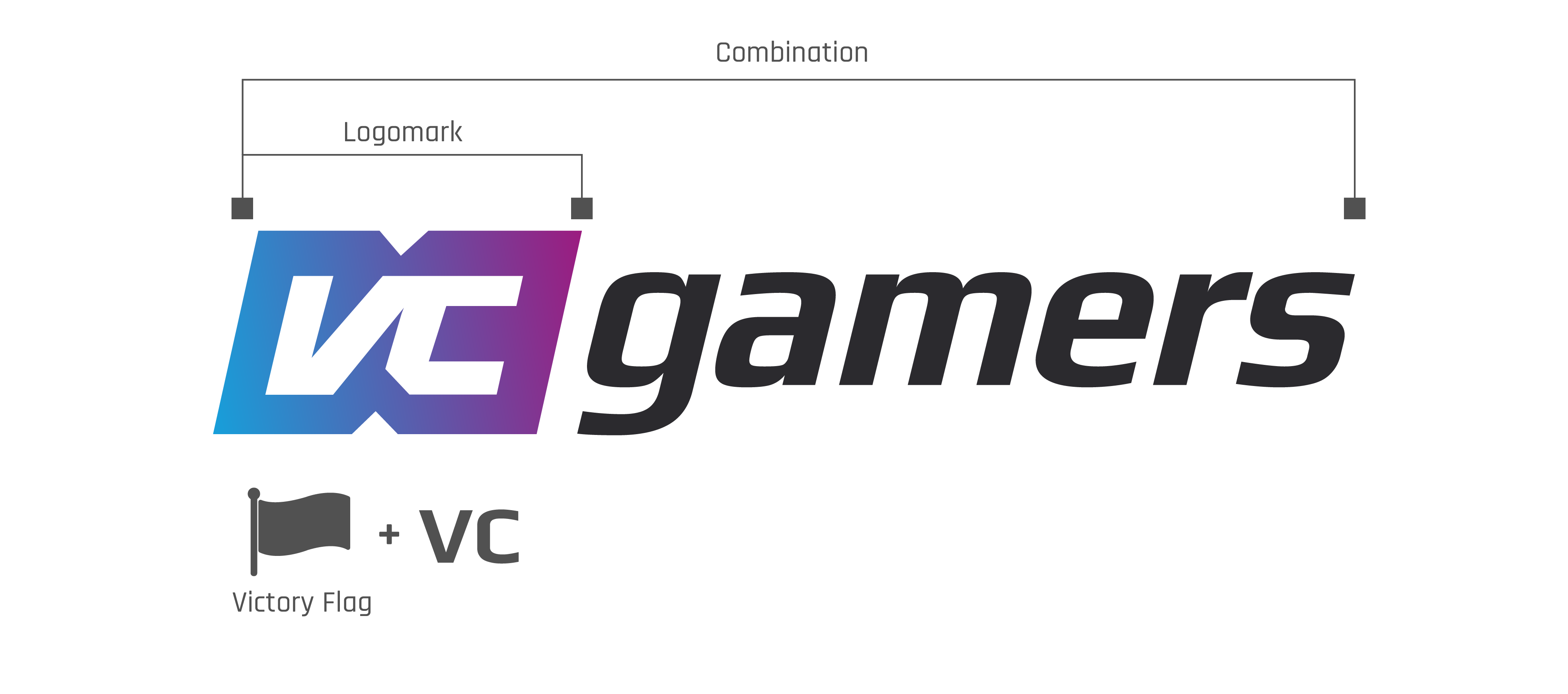
The VCGamers logo is a combination of 2 elements
Logomark
We deliberately embedded the flag design with the letters VC as an abbreviation for the word "Victory" as a symbol of victory for gamers.
Combination
The combination of these two elements is what ultimately represents the VCGamers brand name.
Implementation Variations
There is no one size fits all.

Black
Logo with black writing, can be used on a white background or according to the color configuration that we have determined

White
Logo with white writing, can be used on a black background or according to the color configuration that we have determined

Black & White Flat
The logo and writing are flat black/white, can be used according to the color configuration that we have determined
Construction
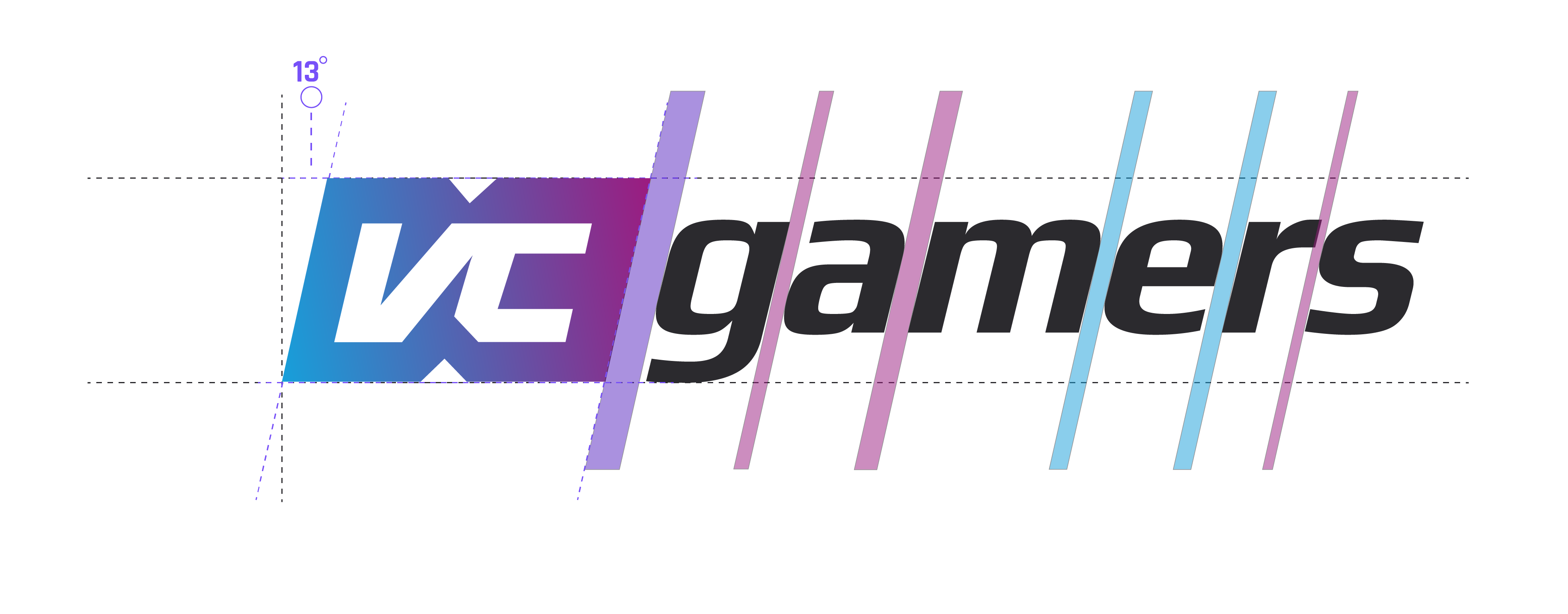
To make the default logo display consistently across platforms, we adjusted logo construction from slant and kerning between logo types for readability.
Color Configuration
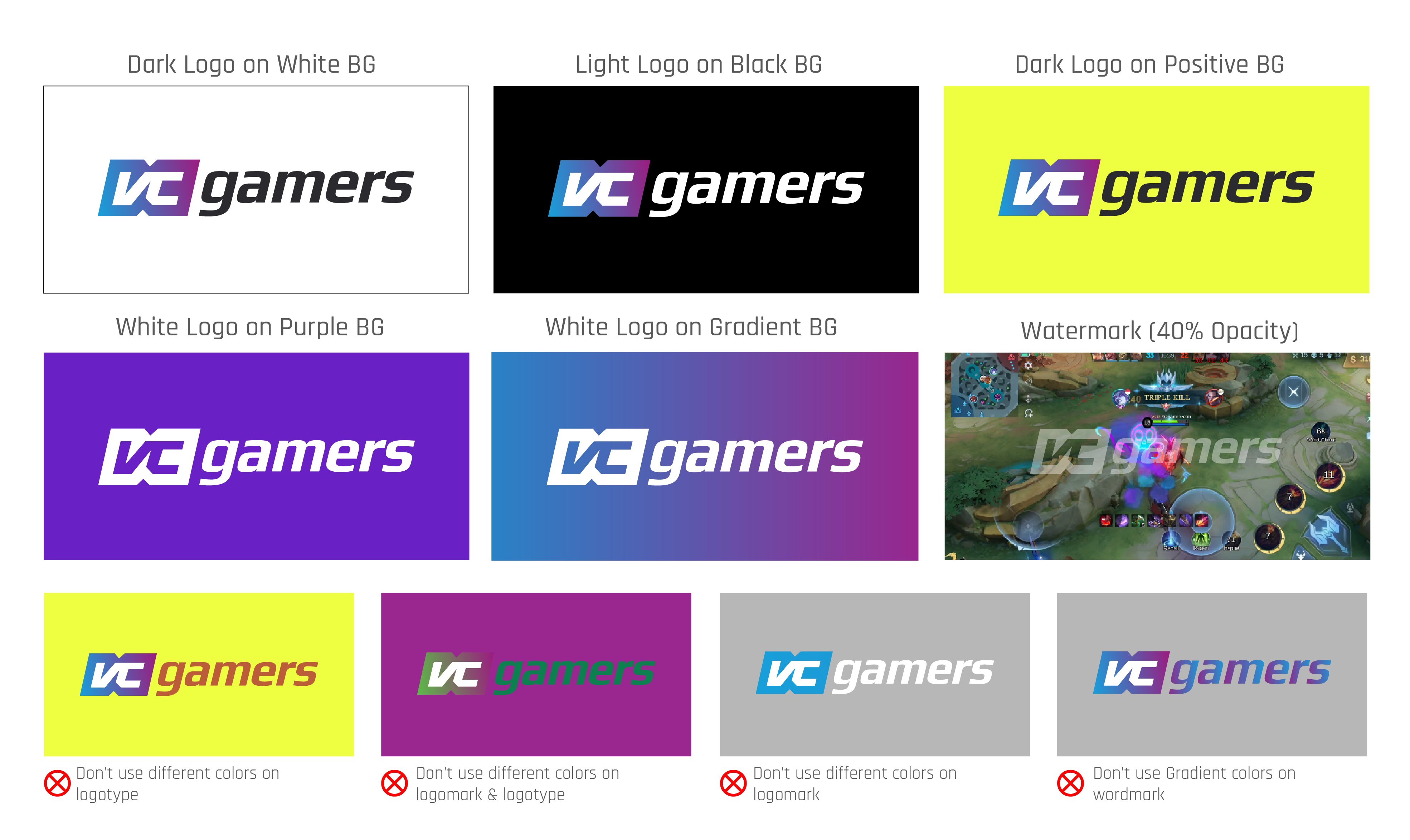
Not all media have to use a logo with the main color. Otherwise, it's important to ensure consistency and brand recognition across media and apps.
By specifying a specific color set for a logo, a brand can ensure that it is consistent across all marketing materials, from digital to print.
Safe Area
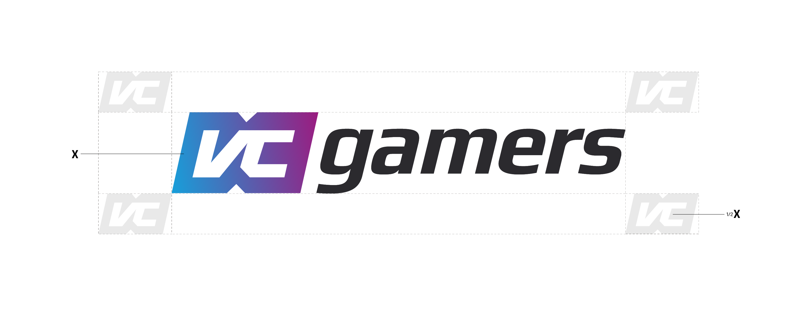
Space limits What is clear is that around the logo type must be considered and proportional to the half width of the brand logo.
When a logo is used, there is at least a half empty distance from the brand logo that must be maintained
Proportion
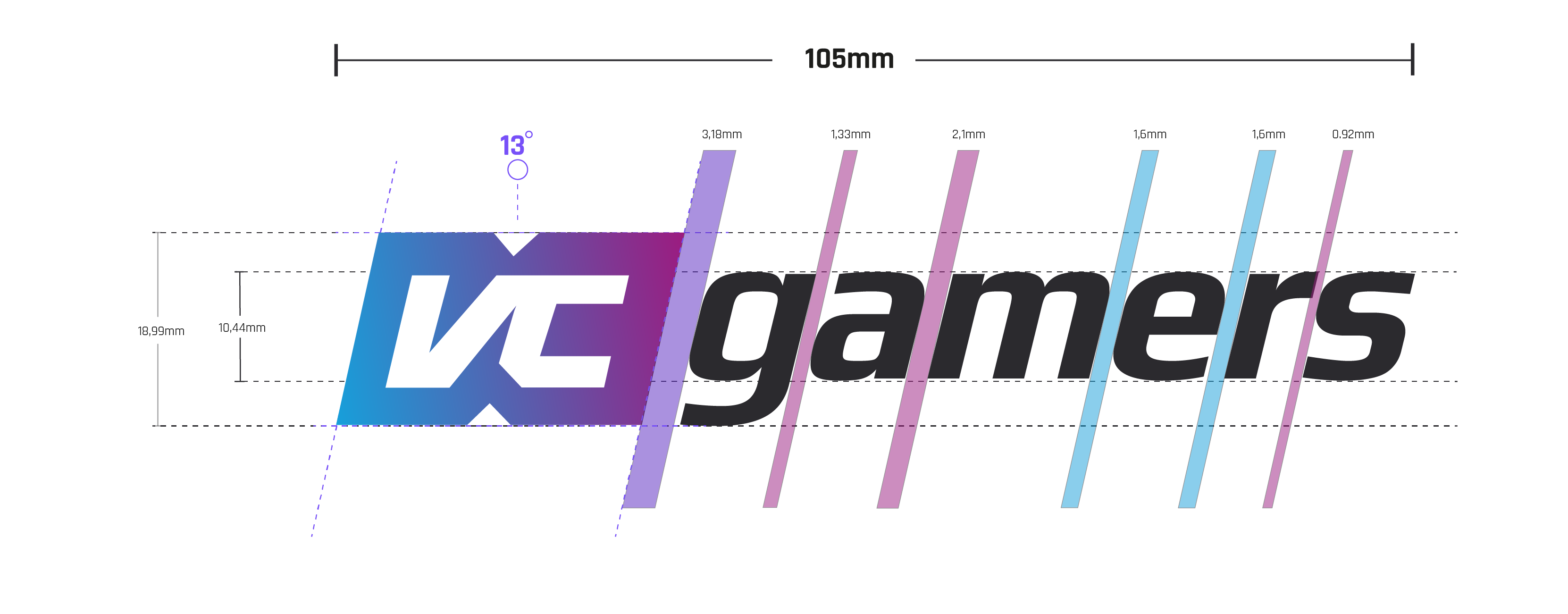
To minimize the display If you are not professional, it is important to create a logo design that is balanced and visually appealing.
This proportion determines the balance between brand and logo type. In a vertical logo, the brand mark must be larger than the horizontal one but still have the same slope.
Digital & Print Usage
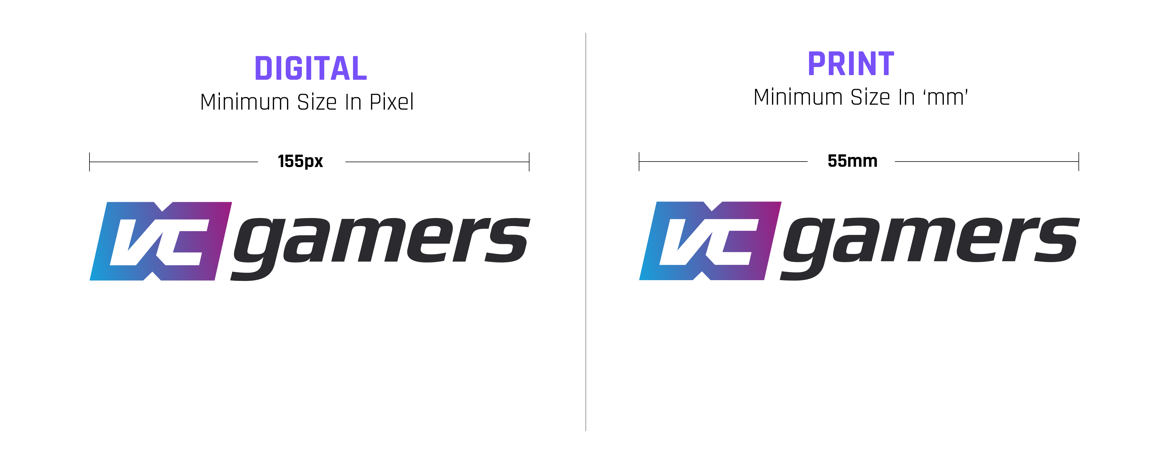
Logo readability depending on pixels, resolution, color pigment, and printing method, among other things. To keep things good, we maintain standard minimum sizes for digital and print.
Partnership
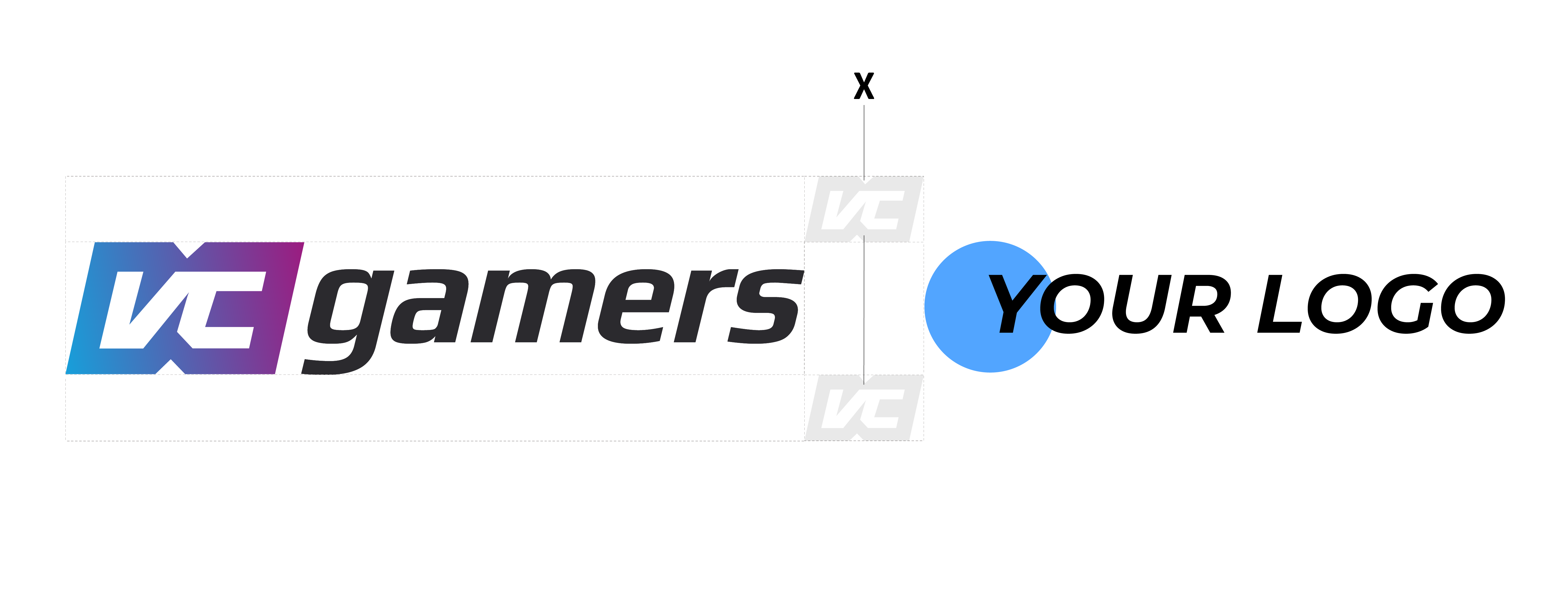
Partnership logo alignment must follow the rules clear space in a safe area. When pairing the VCGamers masterbrand logo with a partner logo, both logos must be proportionally balanced in terms of size.
The height of both logos should be shorter than the dotted line separating them. The VCGamers logo should always be placed on the left.

Apps
To highlight the brand in thousands of applications on the market, we need to highlight all aspects of the brand in one medium. A safe area is needed so that the logo is easily recognized.

Placement
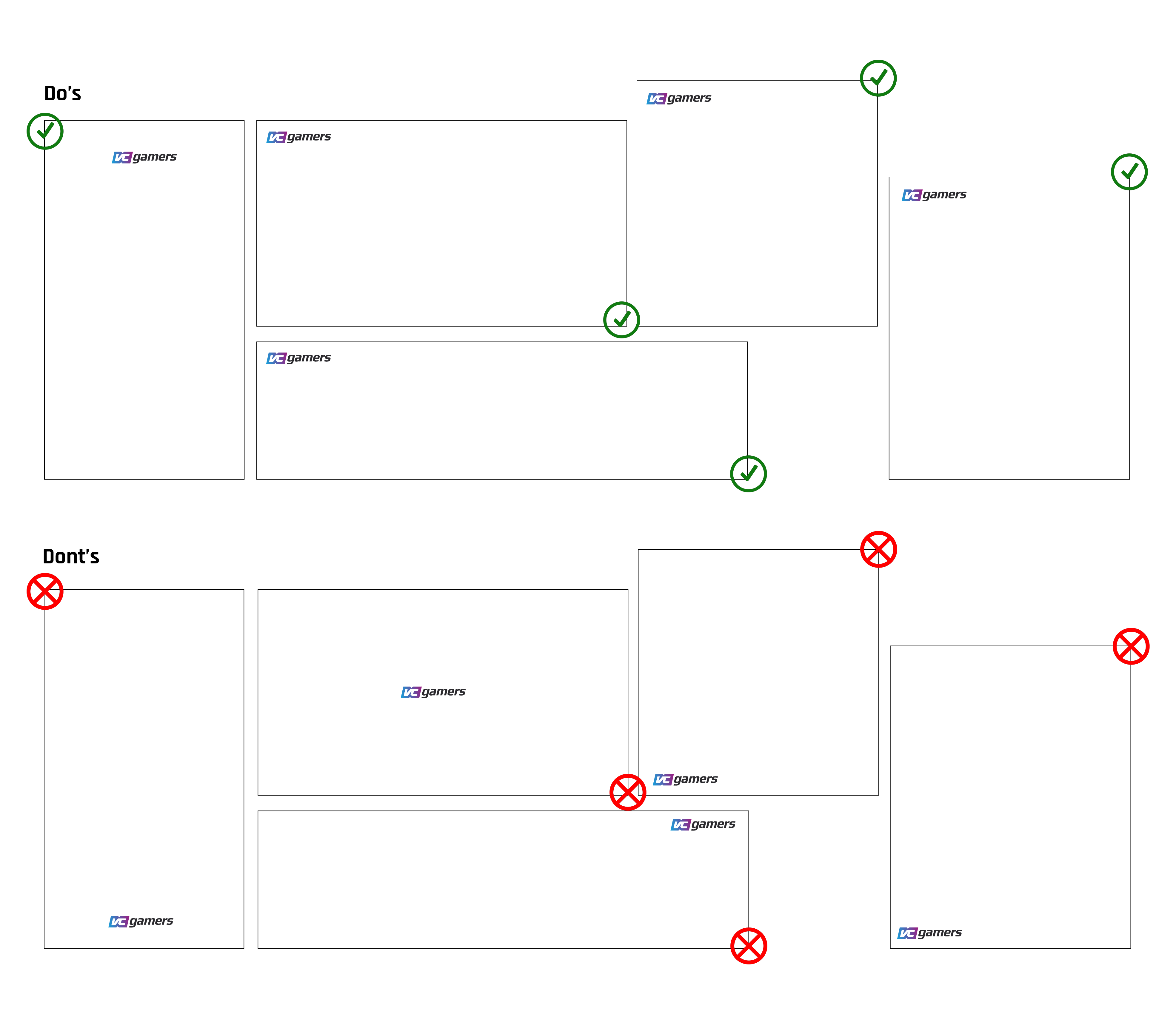
Logo placement preferably in the top left corner of the canvas.
For special cases, place the logo at the top center if the canvas height is longer.
